I’ve always been fond of maps. Enigmatic countries, beautiful names, pirates’ treasures… Many of the dear old books had maps: the Hundred-Acre Wood in “Winny the Pooh”, Shvambraniya by Leo Cassil, Oecumene (always in Latin for some reason) in the academic edition of Herodotus, Stevenson’s “Treasure Island”, and encyclopedias’ war maps…
I used to fill my square-ruled exercise books with fantasy worlds, constructed fields for make-believe games, and treated a spelling book as a quest; I pictured Moscow as a city inhabited by houses-creatures – well, it’s hard to recall, there are too many to mention.
So, I was more than ready when Ilya Merenzon, the editor-in- chief of the New York journal “Russia” suggested creating a Literary Map of Moscow.
In cooperation with “Russia!” both English and Russian maps were issued; each had two variants – a modest square version available for ordering, and a posh artist’s proof on a full-sized sheet of designer paper.
The typographics of the Moscow literary map has become its drawcard. Normally these sorts of maps were hand-drawn (like Paula Sher famous picture maps). On the Moscow Literary Map we used a unique library of fonts – over one hundred typefaces in all, from our own studio, Letterhead. This has been never done before. The Map had already several hugely successful editions.
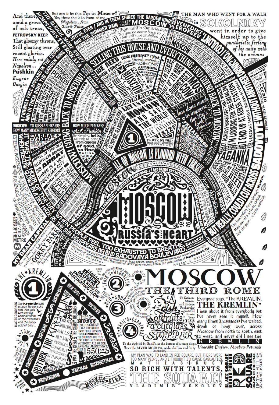
But not resting on our laurels, we came up and published – My Moscow – another map, but this time tracing all the streets encircled by Sadovoye Col’tso and some other 140 points of interest, that have been chosen by Muscovites in the Live journal game.
A new project – is a St. Petersburg map – “From suburbs to the centre. The city speaking”. Petersburg is the focus place of the fundamental texts of our culture. Pushkin, Gogol, Dostoevsky, Belyi, Annensky, Mandelshtam, Kharms, Brodsky… Quotations are clashing and bumping and splicing and talking to each other and finally get bound together into one unfired buzzing city, a stream of words and consciousness.
The Petersburg map has been designed and constructed as an all-of-a piece visual-poetical object, in which all words and landmarks, and topography and history are tightly interconnected. The babble of speech resonating with the city as a whole makes its start in the suburbs, then the trail of quotes becomes ever more dense closer to the centre … While, right in the centre, they squeeze themselves precisely into the tight confines of a city block, a square, or even a building. A perfect fit.
In my work on the maps – My Moscow and Petersburg I enjoyed the assistance of a wonderful designer – Heather Hermit.
In 2015-16, three more maps were issued. The first of them is Montenegro. For two years I participated in the Dukley European Art Center project. An artistic contribution to the development of the Montenegrin visual environment was a giant (2.5 by 70 meters) A map of the Montenegro coast in the Budva-Becici pedestrian tunnel. The map is made in the same manner as the others. The wall is painted by the master of street art Mikhail Dude Oger.
Based on this megaproject, a map of the entire Central Mountain was made in the Montenegrin language, with simultaneous use of Cyrillic and Latin letters.
At the end of the year, I started another project — the Moscow Speaks map. This is a variation on the theme of a literary map, played in the style of urban conversations. Quotes are divided into lines and even individual words, they talk to each other and to the places where they live. There are literary quotes, urban memes, and my own aphorisms on the map. Friends from LiveJournal and friends from FB helped to compose a text for talking Moscow.
For the new year 2017, he released another map — "Moscow in one word". It shows the whole city from MKAD to MKAD for the first time in my practice. This is an unusual map with folk (or quasi-folk) names of places: streets, metro stations, rivers, districts, etc.
If you look closely, you can find several temporary layers of the Moscow language in the names. The streets in the center keep folk nicknames from centuries ago. On the outskirts there are traces of the rapid expansion of the city since the 60s of the last century. Finally, metro stations are nicknamed in the newspeak of the two thousandth and are not always understandable to native Muscovites. The words, as usual, were collected using social networks.
"Moscow in a word" turned out to be the most time—consuming of all the maps: it took three months to collect the material, two months to draw. She is also the most shallow: in some cases she had to go down to petit, and in one place nonpareil was used. Five "Moscow" fonts were made for the map: MosType, MosDor, and Mostytool (three typefaces).
"Moscow – the city of artisans" was released at the end of 2017. This map was originally made to decorate a huge wall in the Citydel business center on the Earthen Rampart. It shows all the handicraft settlements within the Garden Ring. According to the names of streets and alleys, one can imagine how medieval Moscow lived, from which practically nothing except these names has been preserved.
In 2019, the second edition of My Moscow was published. There are 24 more points on the map. The typography has been updated and the ornaments have been completely revised. Daria Litvak helped me with the work on the new version of the map.
At the very end of 2020, the most unusual of my maps was published — the novel "Moscow in a Hundred Houses". This is a story about those objects (not only houses, but also monuments) that, in my opinion, define the face of Moscow now. At the same time, I do not hide the fact that not everything in my beloved city is admired by its inhabitants. Every novel has heroes, villains, and buffoons. There are a lot of them on my map too.
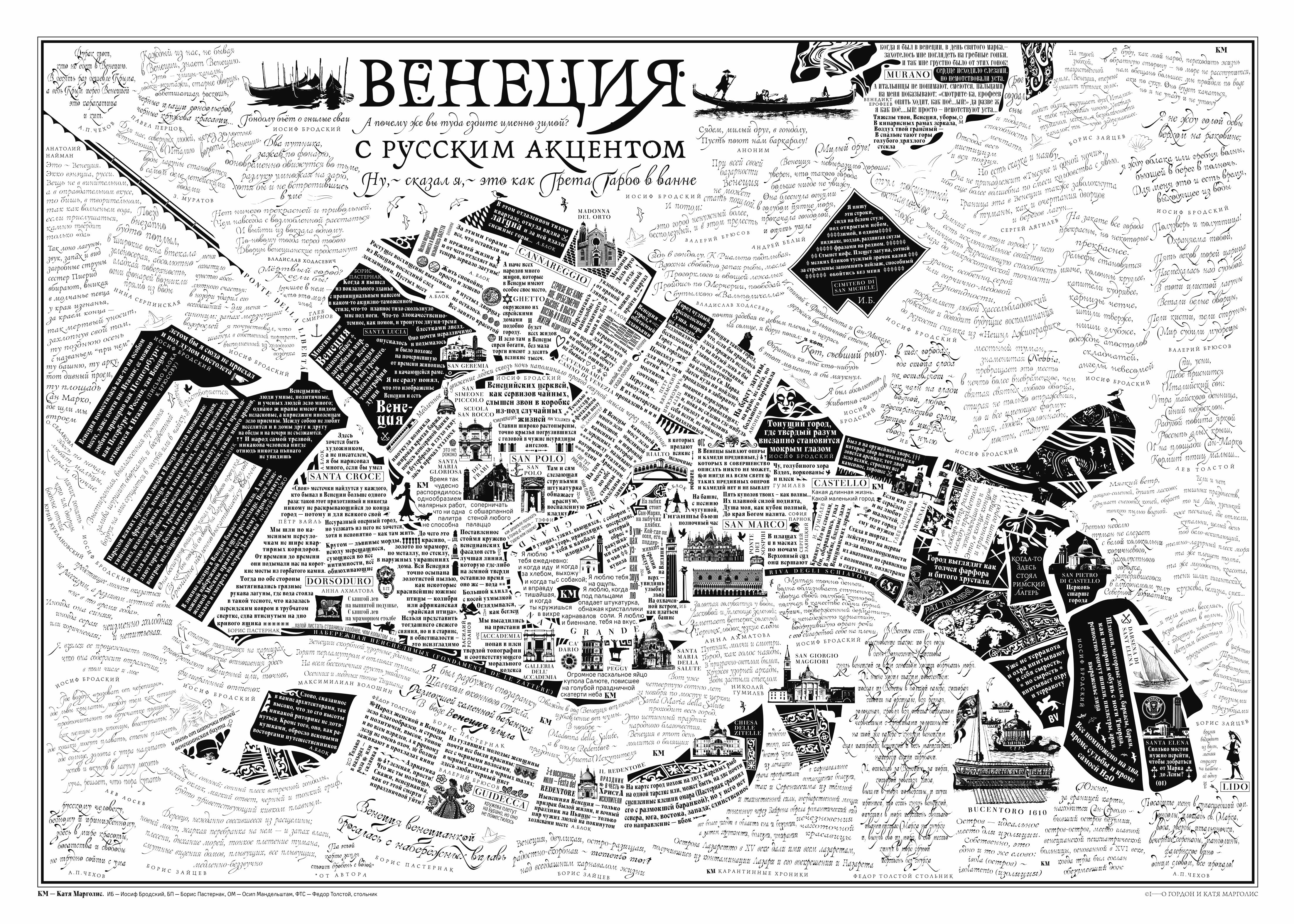
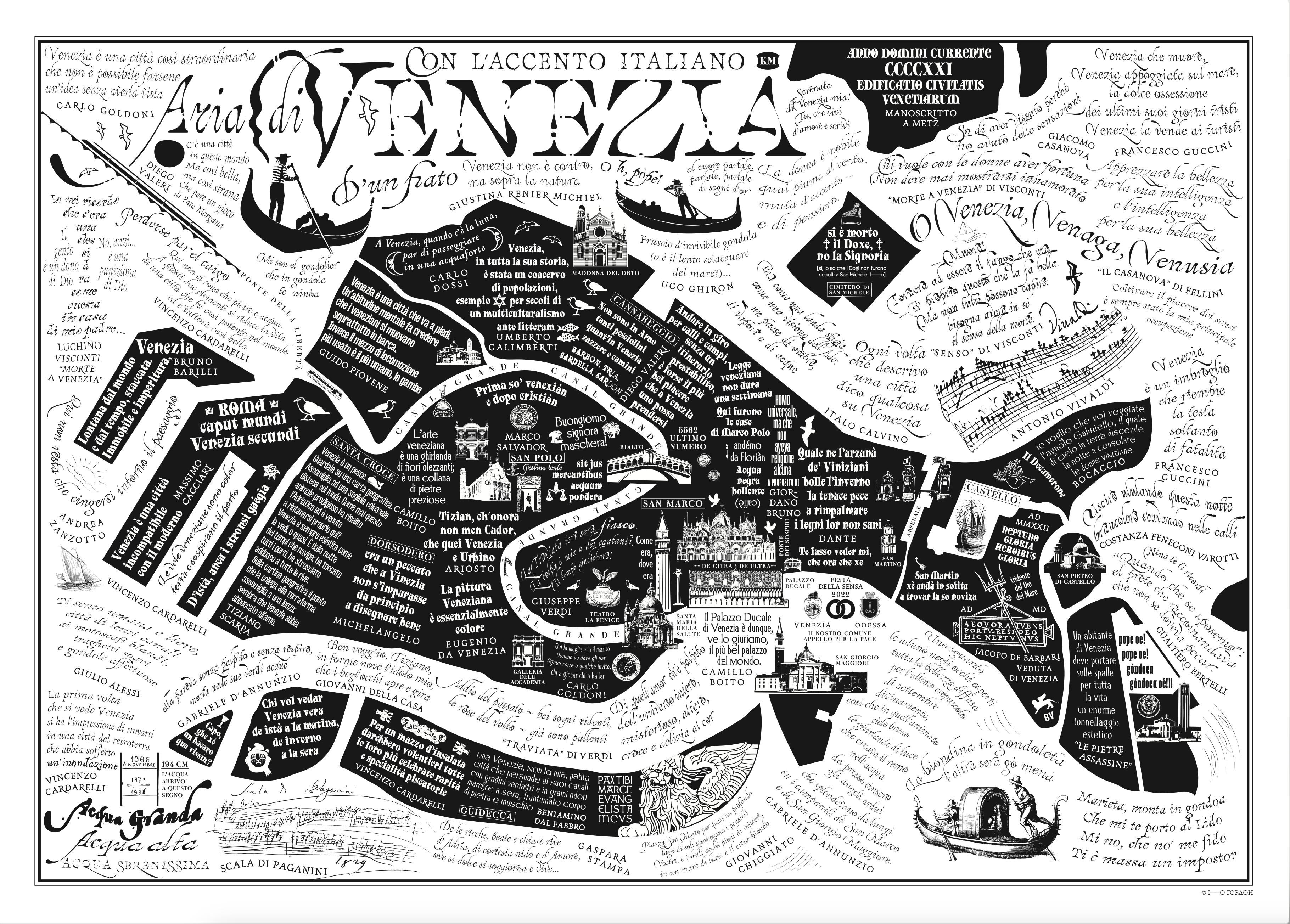
December 2021 — a new addition to the collection. This time there are two maps: "Venice with a Russian accent" and "Venice With An English Accent". The maps were created in collaboration with Katya Margolis, and Robin Saikia took part in the compilation of the English one. Evgenia Selischeva helped make the third map, "Venezia con l'accento Italiano". The map was released on June 18, 2022. Venice is the first decisive step beyond the boundaries of Russian culture.
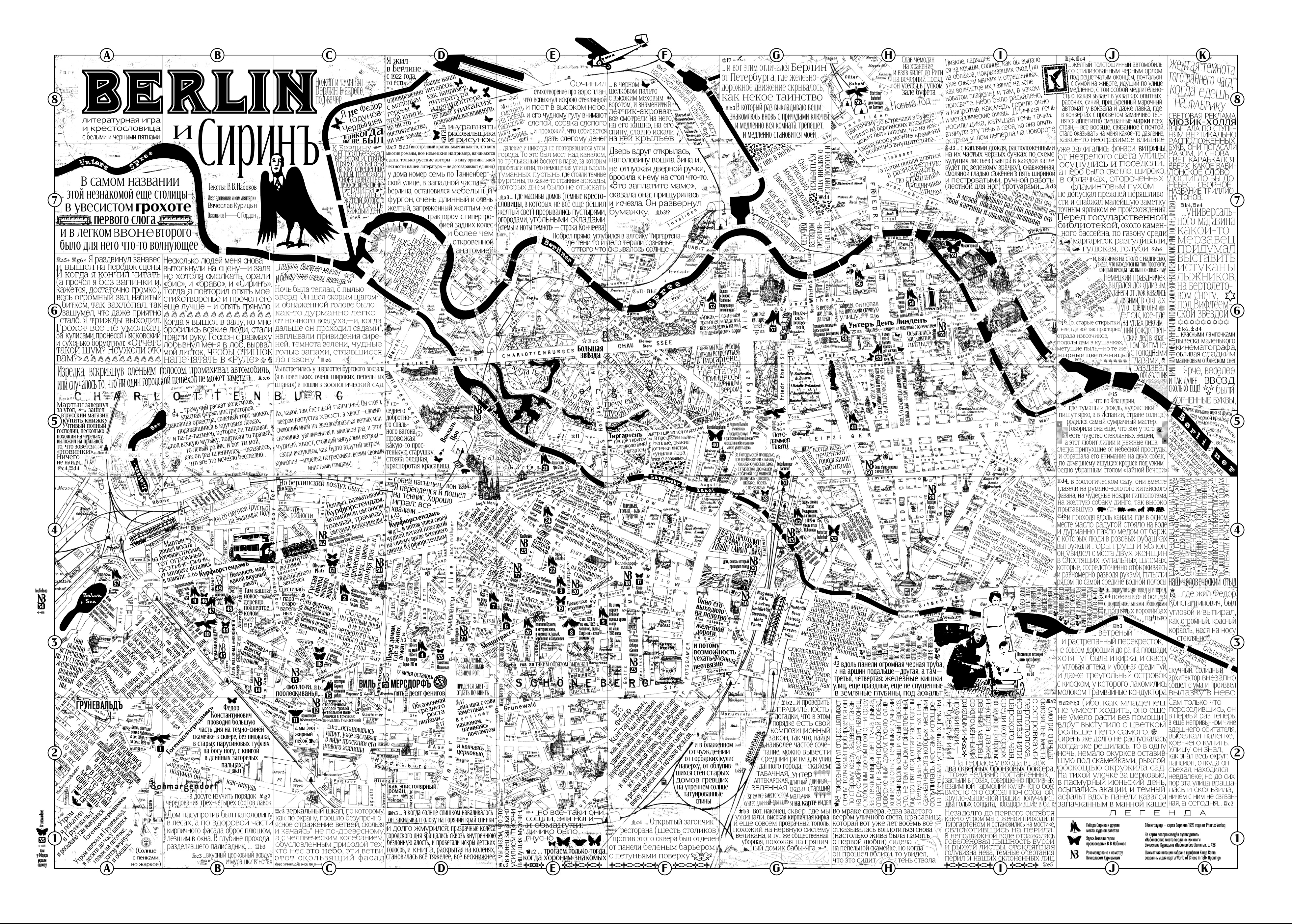
The Berlin and Sirin map (2024) is a very difficult visual and literary game with texts by V. V. Nabokov (V. Sirin), comments by Vyacheslav Kuritsyn from the book Nabokov without Lolita and special reading rules cunningly constructed by the I-O typographer.
A variable font Sirin was built for the map, changing the width, density, height of lowercase letters, sprouting serifs and releasing claws.
Special thanks to the co—author — Vyacheslav Kuritsyn not only allowed the use of comments and maps from his excellent book, but also did a titanic job of collecting Nabokov quotes dedicated to Berlin.
In the background of my map is the original 1928 Berlin plan by Pharus publishing house. This plan is processed in such a way that it is clearly visible only in those areas where Sirin and his heroes have been. The rest of the territory remains the same terra incognita as it was for the young writer a hundred years ago.
The font and map were built from March to November 2024
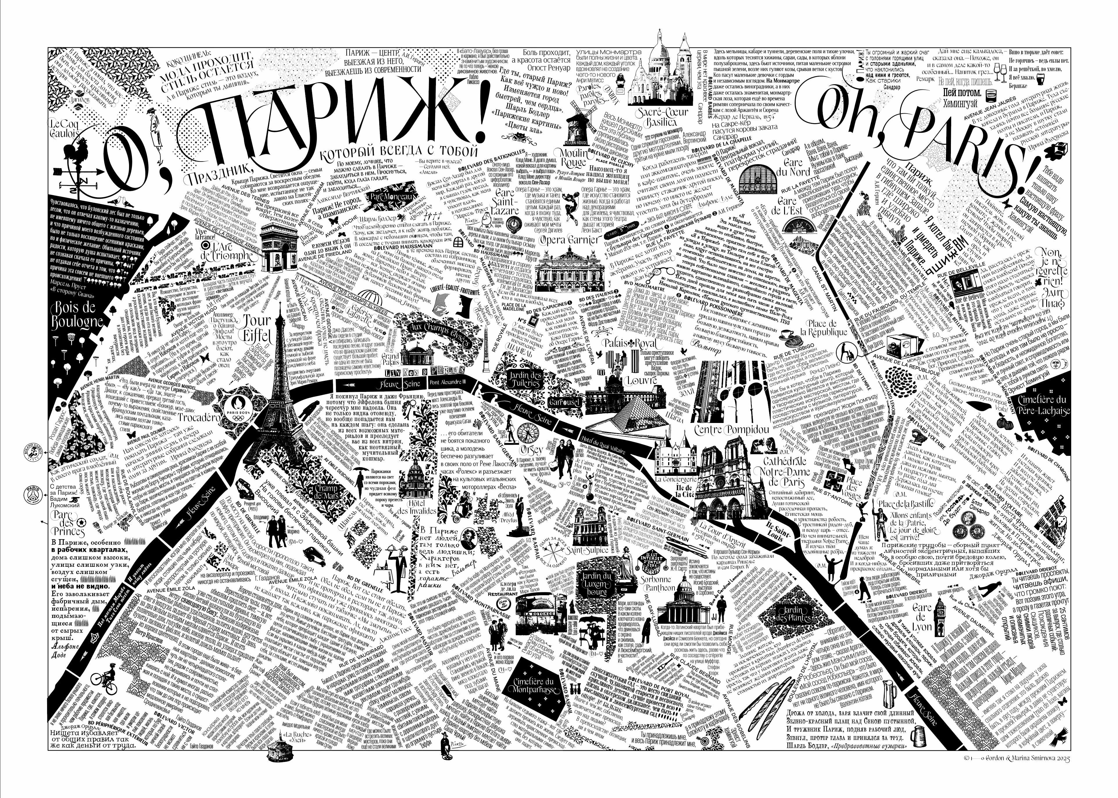
In April 2025, Francophile Marina Smirnova and I released the map "Oh, Paris!"
What makes "Oh, Paris!" different from my other maps? First of all, the scale. A large part of the huge city was included in the frame of the map, so I had to reduce individual objects a lot.
Then, the number of illustrations. There are many more than usual.
And also the deliberate bilingualism. All the quotes are given in Russian, all the names are given in French.
And of course, the typography, where the prima is an elegant Foxie made especially for this card.
This is also the first card for which quotes were collected by AI under the guidance of Yulia Reprintseva.
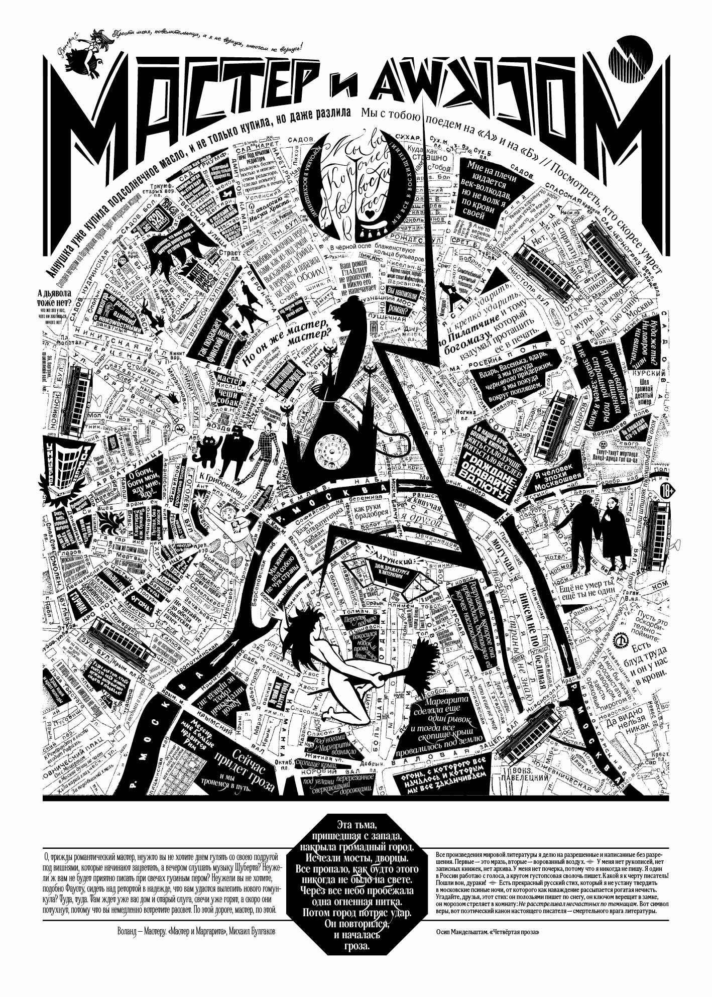
The Master and Moscow map was supposed to be released in time for Walpurgis Night, April 30th, 2026, and also to coincide with the 135th anniversary of Mikhail Bulgakov's birth. But I finished it "on the night between the second and third of January"—the 14th, Osip Mandelstam's 135th birthday. It happened completely by accident, if such accidents are possible.
There are two Masters on my map—and this is certainly no coincidence. One is the alter ego of Mikhail Bulgakov, the author of The Master and Margarita. The other is the one a certain tyrant on the phone called a Master. The one who said of himself, "I am a man of the era of the Moskvoshvei." It seems to me that the words of one resonate with the words of the other. Mandelstam and Bulgakov are the same age, and both were not spared by the wolfhound of the century. They even lived for a time in the same house on Nashchekinsky Lane.
This map is a mix of high tragedy, everyday drama, romance, and even pulp fiction (from Tverskoy to Gogol), buffoonery, and devilry. It features seven trams, four witches, three impudent buffoons, two (or three) Masters, one primus stove, and a sturgeon of the first freshness.
The Fagot and Azazello fonts were also created for it, and the Elzenskok font became Margarita's voice.
All maps are printed in the Piranesi LAB printing house by Alexey Veselovsky. He had the idea to use colored papers, dyed in bulk, from stock from other circulations. Now the maps exist in more than seventy different formats and colors.
My collection of maps is unique. There is no such thing anywhere else in the world and it is unlikely to appear soon. This requires too many simultaneous circumstances: a cartographer with the skills of an illustrator and a writer, a huge library of his own fonts, the ability to work in an Illustrator and FontLab, an understanding of toponymy, ornaments, heraldry, blogger skills and much, much more.